Over the last seven years I’ve used my own professional practice, review of academic literature and interviewing a range of service design practitioners to help me understand how we might prototype better services. I’ve written a bit about where the work emerged from on this blog before. I’m still researching this (and wish I’d made much more progress over those seven years), but I’ve reached the point where enough people have told me just to write something. So I am, because its important to me that I share it with people who might actually get use out of it.
Prototype fidelity
When we prototype anything, we often talk about what fidelity the thing is. Fidelity is generally meant in terms of ‘how close to the real thing is it’ but is also often used as another way of describing how much time, effort, money and emotional investment has been spent on the prototype. When speaking to designers this was often the case, but they all acknowledged that effort does not necessarily correlate to fidelity (you can have a low effort hi-fidelity prototype for example).
Fidelity is normally talked about as a ‘low’ to ‘high’ scale. But my work has shown that fidelity is often made up of many factors, and if designers were more aware of these factors, we could make better use of prototypes to learn and communicate with others. Before going on, its worth saying that this idea isn’t new, researchers already did this for interaction design prototypes in 2006. I’m just applying the idea to service design.
Through my research I’ve found these seven common factors, I’m calling ‘dimensions of fidelity’ (also the term they used in 2006).
| Dimension | Description |
| Physical environment and location | The physical location and space that the prototype takes place e.g. an office, a workshop room, a persons home or outdoors |
| Service sequencing | The order that the different parts of the service are linked together in the prototype e.g. are they in the order expected of the final service? |
| Touchpoint fidelity | The fidelity of individual things that help make up the service e.g. websites, apps, physical products |
| Human interactions | The people that are involved in the service prototype e.g. are they internal stakeholders or real users and staff? |
| Service time frame | How long the service prototype takes, is it 30 mins or 3 weeks |
| Behind the scenes depth | Are the data, processes and systems involved to sustain the service being tested? Do people have to use dummy data or can they experience it using their own data? Are real systems used to process the data even if no service outcome is arrived at? |
| End-to-end completeness | Is the whole service included within the prototype, or only a section of it? Is the prototype focused on a subset of the overall interactions that make up the service? |
The most important thing to add, is that I’m still reviewing, improving and refining these. I’m looking at interviews as I write this where people have given feedback on this first draft of the dimensions. But I know that publishing wider will enable a much wider group of people to share feedback (if they want to).
I know that some of the concepts might appear academic (which is fair) but the purpose of the work is to create something that can be used by practicing service designers first and foremost. This is how I see that happening.
You need to plan a prototype of a service, there’s a few different methods you can consider, and you want to make sure you learn the right things from this prototype.
To help plan the method you use and exactly the execution of that method, you can weigh up the dimensions one by one to make sure you’re going to learn what you want to.
A real life example
I was part of a team working on the redesign of a kids saving account that would go on to become ‘Dylan’s saving squad’ and Dylan Young Saver account. At the time we were testing an integrated and engaging account experience. Lets run through how we prototyped it, using the 7 dimensions.
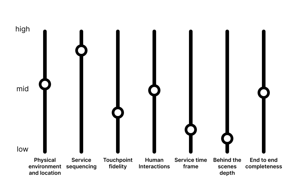
Physical environment: We hosted the prototype in our design offices, using 3 distinct spaces to represent different locations the account might be used (branch and home). To help with the branch experience we built a counter in our ‘lab’ space and installed a tensa-barrier for queuing. We considered a real branch, but the logistics were too great and would have involved shutting a branch, or out of hours research which would have been difficult when trying to research with children (we were already holding it late afternoon to avoid school).
Our environment was probably mid fidelity – it wasn’t the final location, but we adapted it to make it feel contextual. This was OK, given that we knew we would have limited scope to redesign the physical branch. It wasn’t a research priority.
Service Sequencing: We consciously split the experience up into steps that would be experienced at home (the delivery of an account pack), then depositing money in the branch, to then returning home to see the impact of that deposit. It made for pretty complicated overlapping research sessions whilst we tried to squeeze as many participants into a limited time window, but it was important to us that we could find out whether a child and their parent could see how the different parts of the account linked up.
Our sequencing was high fidelity, because it was something we definitely wanted to learn.
Touchpoint fidelity: We had a number of different physical and digital touchpoints, including a proposed app for use at home, an on-screen experience in store, as well as physical products to form part of the account pack. As you’d expect, they varied slightly, but it was important for us that we didn’t invest time/money etc in these before testing the overall service. The apps were all line drawn basic prototypes, with some gifs for animations, strung together by myself in Invision (those were the days!). The account pack was a macbook box, covered in printed materials, and we printed a little book to go inside too (with a story in it).
Our touchpoints were low-mid fidelity, because these were the things we planned to develop, once we had confidence the service as a whole made sense to people.
Human interactions: We knew we needed to get children involved to experience the prototype – we weren’t 100% sure which age it would be most appropriate for, so we recruited a range, along with their parents/grandparents/carers. However we didn’t have real branch staff, we used our own colleagues as stand ins for this, and gave them a very basic script to use. We did separately get feedback from real branch staff on the concept another day, but not as part of the testing with customers.
Our human interactions were probably mid fidelity as well, real users (which was very important) but not real staff.
Timeframe: Everyone experience the process of receiving their account pack, depositing money into their account, and interacting with an app once that money was deposited within the span of about 45 mins. This of course isn’t the expected timeframe of people using the account. In reality doing this process over about a week, might have made sense. Our sequencing was high (things in the right order) but our timeframe not so much.
Our timeframe was low fidelity.
Service depth: We had no back-end processes or systems in use for the prototype, we didn’t have any planned significant changes in the case of this proposed service, it was primarily customer experience related.
Our System depth was low fidelity.
Completeness: Whilst we sequenced multiple stages of the account experience, we didn’t go all the way from discovery and opening the account, through to closing the account down. We focused primarily on what you might call the ‘use phase’. Again this was driven by trying to fit our riskiest assumptions into a pragmatic time frame for getting user feedback.
Our completeness was mid fidelity, we chose to focus on some specific parts of the service, rather than a total end-to-end experience.
The graphic equaliser
When talking to others about this concept, I’ve referred to a single scale of fidelity being like a volume control, and mixed fidelity being more like a graphic equaliser where you can control different aspects of the sound. So if I use that visual picture again, the dimensions for the savings account example above might look a bit like this:
I wanted to finish by emphasising my belief that its not always the aim to get every single one of these as high as possible for every prototype. The reason this way of thinking is helpful is that it allows you to prioritise what you want to learn most about, whilst not losing the feeling of the whole service. You don’t need every dimension to be high, but you do need to consider each one of them.
I’m genuinely very keen for feedback on this, whether just a comment or you want to talk more in depth about it. Or maybe you’ve been able to put it into practice, let me know 🙂


Leave a comment